
YWCA Website Accessibility Audit
The Young Women's Christian Association (YWCA) was founded in 1855, making it one of the oldest and largest multicultural women's organizations in the world. The YWCA has been at the forefront of the most pressing social movements for more than 160 years—from voting rights to civil rights, from affordable housing to pay equity, from violence prevention to health care reform. The organization serves over 25 million women and girls in more than 100 countries worldwide and actively advocates for policies that combat social injustice, support women's empowerment, and promote racial equity.
My Role
UX Researcher
Tools Used
WAVE Accessibility Evaluation Tool
Axe Accessibility
NDVA 2024.2 Screen Reader
Keyboard-only Navigation
Website zoom set at 400%
Type of Work
Accessibility Audit
Timeline
Aug. 2024
I chose to perform an accessibility audit on their website, specifically their Home and Find Your YWCA pages.
*This project was done as part of my UX 835: Accessibility and Design class*

What Is Website Accessibility?
Website accessibility is the act of designing and developing websites in a way that allows all users, including those with disabilities, to access, navigate, and interact with the content effectively. It's important because it provides a better user experience and ensures more users can access information.
The Web Content Accessibility Guidelines (WCAG) are a set of recommendations for making web content more accessible for more users.
To complete this audit, I focused on adhering to the AA (mid-range) level of conformance.
Testing Methods
-
WAVE Accessibility Evaluation Tool (automatic) was used to identify WCAG errors within the site.
-
Axe Accessibility (automatic) was used to identify WCAG errors within the site and to see if there were any discrepancies between itself and WAVE.
-
NVDA 2024.2 screen reader (automatic) was used to simulate how users who could be visually impaired interacts with the site.
-
Keyboard-only navigation (manual) was used to simulate how users interact with the site without the use of a mouse.
-
Website zoom set at 400% (manual) was used to simulate how users who could be visually impaired interacts with the site.

No Assistive Technology
For the first walkthrough of the website, I used no assistive technology as a control group.
WAVE Accessibility Evaluation Tool
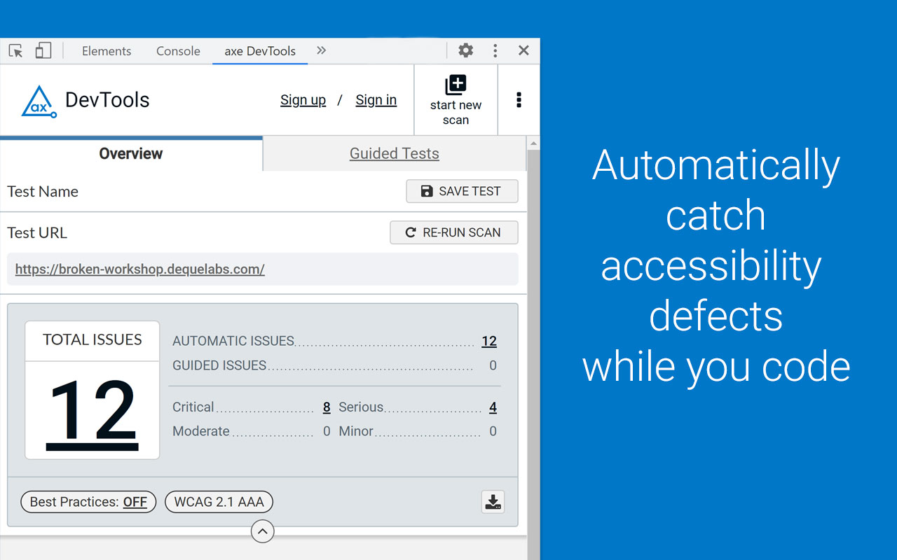
The WAVE Accessibility Evaluation tool aims to automatically identify any WCAG errors with the press of a button. Although the process is automatic, a person has to go through and manually check the errors. With this tool I uncovered many errors, mostly relating to contrast errors with the buttons on the page.
AXE Accessibility Evaluation Tool
Axe devTools web accessibility tester aims to provide automatic testing (similar to WAVE) by finding accessibility issues within the website.
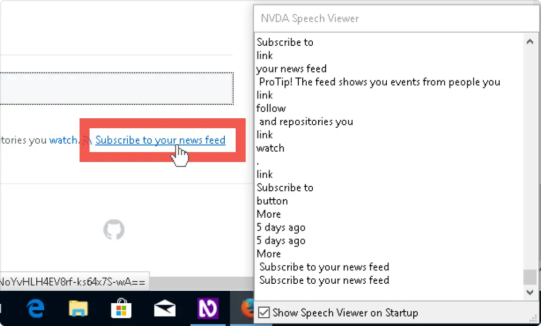
NVDA 2024.2 Screen Reader
NDVA (version 2024.2) is a screen reader that reads and transcribes text on a webpage, and also narrates the user's inputs on the keyboard. It is primarily used by people with visual impairments.
Keyboard-only navigation
The keyboard-only navigation aims to simulate how a person without a mouse, or relies heavily on the keyboard, would view the webpage. I uncovered a glaring issue with the main navigation bar option when trying to go through the webpage.
Website zoom at 400%
The website zoom set at 400% aims to simulate how a person with vision impairments (for example, low vision) would view the webpage. Although the content was centered on the page, there were glaring issues with trying to navigate around the website.
Navigating the Website
Accessibility Issues
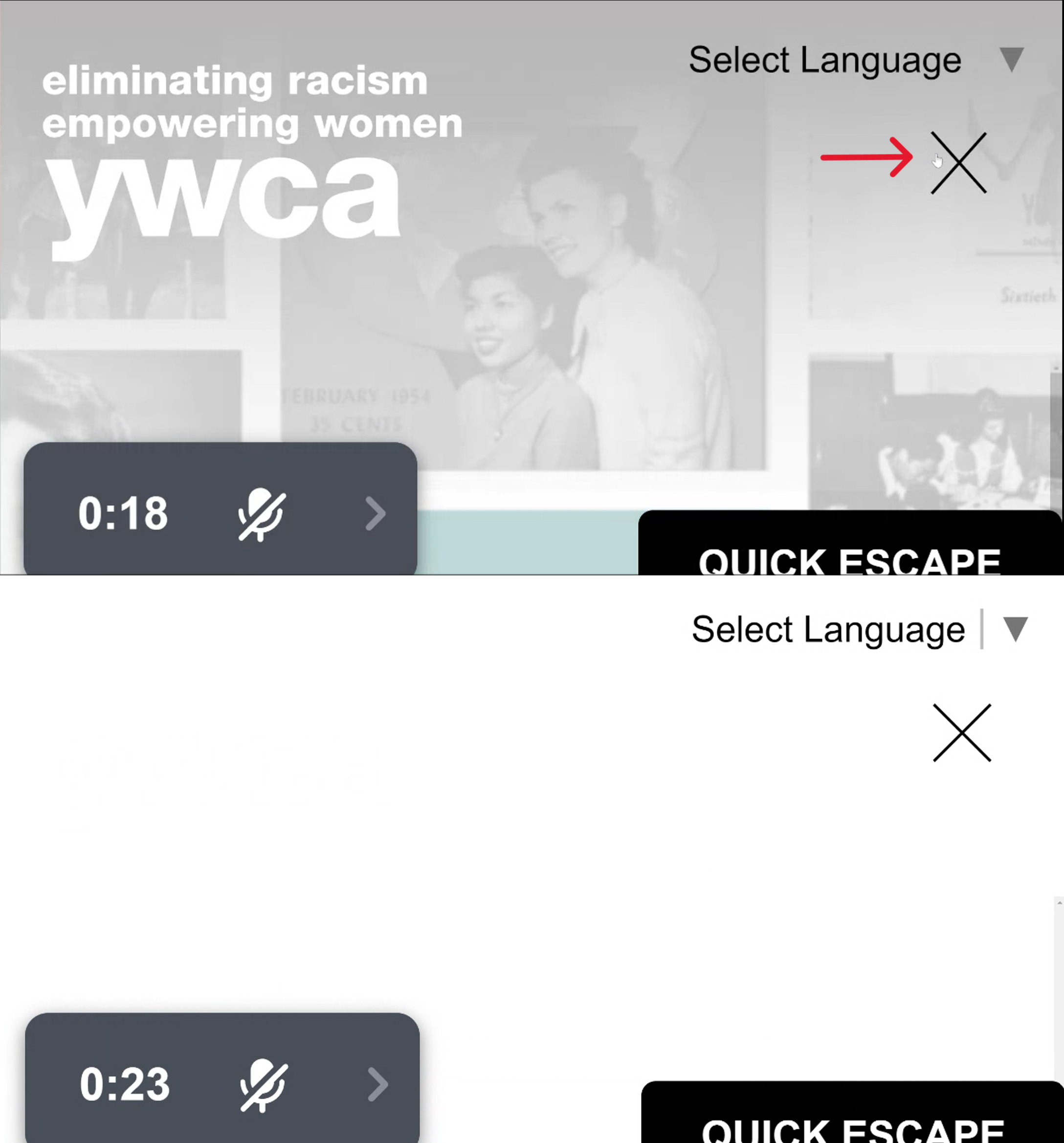
Rule broken: Make all functionality available from a keyboard.
The menu text and links are not visible after pressing the horizontal menu (it changed to an X). Instead, it's just a bunch of white space. The navigation bar is also inaccessible when navigating the webpage using the keyboard only. This is also in violation of WCAG 2.2 Section 1.4.13: Content on Hover or Focus where if the user hovers the mouse or uses the keyboard to make additional content appear, it should also remain visible when hovering over the additional content as well as disappear when the user dismisses the content or removes the pointer.
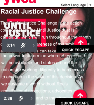
Rule broken: Make text content readable and understandable.
The text bleeds on other text and background images. Also, the white text against the woman's shirt color is not AA compliant. This violates WCAG 2.2 section 1.4.11: Non-text Contrast where the visual presentation must have a contrast ratio of at least 3:1 against adjacent color(s). Among these issues, the buttons on the page do not have proper contrast when highlighted (as noted by Axe in the video from above).
Recommendations
-
Re-code the main navigation bar to show up when the page is zoomed in and when the user is tabbing through the page
-
Increase the contrast in the buttons when hovering
-
Ensure the text will not "bleed" into other text or images
Conclusion
-
Aside from the main navigation bar and text bleeding into other content, navigating the webpage was easy. Even at 400% zoom, the content was centered on the page.
-
Most of the font is AA-compliant in that it is a dark text on a light background.
-
In addition to the previous recommendations, I also recommend that the YWCA has a more thorough audit performed to guide future design and development decisions.