Henry Ford Health Systems Dashboard Redesign
Fifty-thousand team members provide exceptional care and service at more than 550 sites across Michigan – surrounding patients, members and customers with everything they need – from primary, preventative and urgent care to the most complex and specialty care; health insurance coverage, retail needs including pharmacy and eye care; and a full suite of home health and virtual care services.
Headquartered in Detroit for more than a century, Henry Ford Health has also remained proudly committed to serving our most vulnerable communities – advancing community health programs, fighting health disparities and championing health equity, and providing more than $780 million annually in uncompensated care and coverage.
My Role
Tools Used
Type of Work
Timeline
June - Aug. 2025
Secondary research
Persona creation
Thematic analysis
UI Design
Figma
FigJam
Zoom
UX Designer
Project Background
Henry Ford Health offers an ultrasound training program designed to help military medics master point-of-care ultrasound (POCUS) devices. The program’s goal is to equip medics to perform the procedure efficiently and accurately, capturing 12 specific ultrasound views/images with both speed and precision.
Primary Client Goals:
-
Automation of feedback so that medics can practice independently, reducing the need for an instructor to be physically present.
-
Integrating gamification to increase learning motivation and outcomes.
Team and Roles:
-
Jeffrey Siarto - Program Director, MS in User Experience
-
Joe Ambrose - Lead UX Designer
-
Justin Rucinski - UX Designer
-
Nathan Taylor - UX Designer
-
Pei-Chi Lin - UX Designer
-
Tiara Stinson Lavender - UX Designer
Key Decisions and Rationale
For the first iteration of this project, our main focus was on the following:
-
Understanding and documenting the current training process
-
Providing the sponsor with design and branding recommendations
-
Completing high-fidelity prototypes of two screens in the future-state user flow
Market Research
We conducted market research to understand existing MRI training systems and medical training programs, especially those for military personnel. We focused on the user interface (UI), design patterns, and common practices to help us create a system that is familiar and easy for new users.
I researched Scanbooster, a mobile ultrasound simulator and training application that turns smartphones into ultrasound wands, offering OBGYN and POCUS learning modes. The app's key strengths include comprehensive labeling and color-coding of anatomical structures, gamified learning with a 0-5 star rating system that requires training every four weeks, and standard ultrasound controls like brightness and zoom adjustments. Users can access the platform on phones or tablets with free lifetime updates.
However, the app suffers from significant accuracy issues as a simulation tool, with users reporting false pregnancy readings and other incorrect displays, while lacking profile creation for personalized experiences.
The other applications and devices my team researched were Butterfly iQ, Vscan Air, Clarius, Philips Lumify, and ATIS. Some of the application strengths that stood out to us were the clear and simple UI and the fact that users could view and download reports, so we implemented those features in our UI.
Market Research, cont.
Some of the other applications and devices my team researched were Butterfly iQ, Vscan Air, Clarius, Philips Lumify, and ATIS. To aid in the gamification request, we also researched leaderboards for popular apps and games such as Quizizz, Strava, and Speedrun.
Some of the strengths that stood out to us were Quizizz's class accuracy and score and Strava's data input, so we implemented those features in the design of our interface.
In-Person Demo
Members of the cohort who live close to Detroit were able to view a hands-on demonstration of the current tools the medical professions uses to perform ultrasounds.
My team noticed the following pain points during the demonstration:
-
In order to operate the testing, there needs to be 3-4 people. 1 student, 1 professor, and 1-2 lab assistants.
-
The scorecard has to be physically printed with no way for the student to view their progress digitally.
Here are pictures of the product in use and current UI.


Research Insights
Pain Points Identified
-
Communication Challenges – The loud training environment makes it difficult for lab assistants to hear instructors or students when recording times.
-
High Manual Effort – Excel files are labor- and time-intensive, requiring lab assistant involvement, which prevents the process from being self-sustaining/automated.
-
Risk of Human Error – Manual data entry in Excel increases the potential for mistakes.
User Personas
User Persona 1
Jordan Taylor is a newly trained Army Combat Medic in the crucial early stages of medical specialization training. As someone with moderate tech skills, Jordan represents the ambitious but sometimes overwhelmed new military healthcare professional who thrives on structured, confidence-building learning experiences.
Jordan needs beginner-accessible simulations that gradually build complexity, allowing them to develop confidence before facing high-pressure scenarios. They respond best to realistic, visual training materials that bridge the gap between medical theory and practical application, supported by structured feedback systems that acknowledge progress and provide clear improvement pathways.
User Persona 2
Dana Mitchell is a seasoned Senior Clinical Instructor with over two decades of military medical expertise, specializing in ultrasound and diagnostic imaging training. As a leader managing 10-15 medics or clinical trainees simultaneously, Dana faces the constant challenge of delivering quality instruction while juggling multiple learners in high-intensity laboratory environments.
Dana needs technology that acts as a force multiplier, providing automated progress monitoring and objective performance analytics that highlight struggling students in real-time. They value systems that reduce administrative overhead while generating actionable insights, allowing them to focus energy on high-impact teaching moments rather than data collection.
Brainstorming Features
We compiled all the features we wanted to include in our UI. We landed on the following features to include in our UI:
-
Display statistics to individual users so they can see what they can improve on.
-
A proficiency or progress dashboard.
-
A timed mode to see how fast the student completed the scan.
-
Review videos so students can see their previous scans.
-
An instructor "command station" to view their students' progress.
-
An option to download previous reports.
-
A way for students to view how their completion times compare to the rest of their cohort.
Service Blueprint
We created a service blueprint to highlight the current process from the time a student is enrolled in the course to how the professor reviews their data. We also highlighted any pain points in the process such as the instructor having to focus their attention between the student and recording feedback on an iPad, the loud environment, and human errors such as accidentally entering the wrong data.
User Journey
We created a user journey map to visualize the process of how the students and instructors interact with the new UI.
Our main features would be for the students to create a profile, login, review a previous scorecard, and review the leaderboard before exiting the app.
For the instructors, our main features would be for them to create a profile, login, record a new scan, provide feedback for an individual student, review a previous scorecard for an individual student, and review the leaderboard before exiting the app.
Deliverables
Brand UI Kit
We created a UI kit to help guide our design so that the deliverables will be consistent.
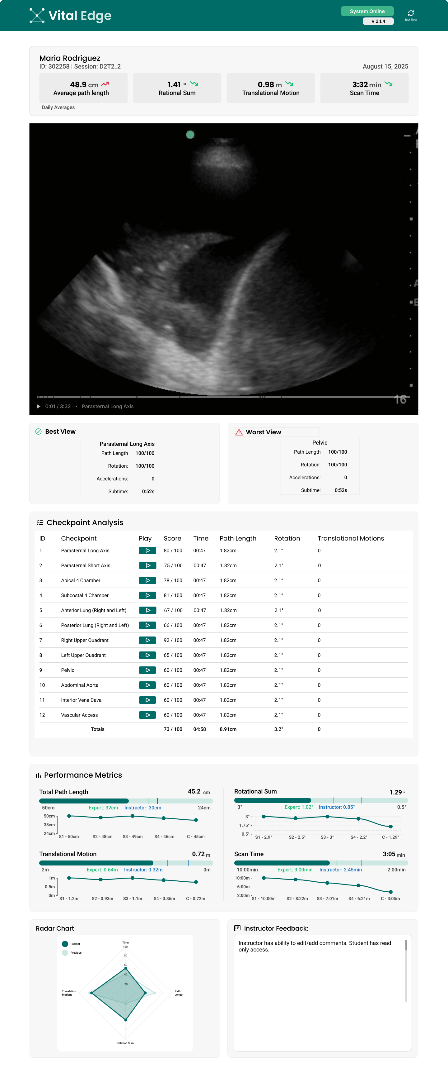
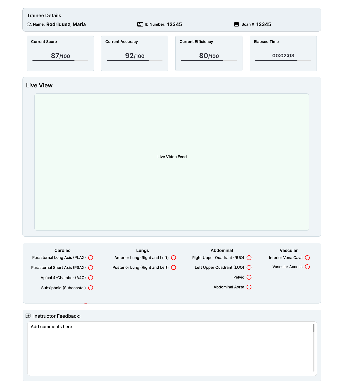
Scorecard
We included a way for students to view their metrics, including how their new session compares to the previous sessions, a way for them to view their last captured scan via video, a way to view how their scan compares to their professor, and a digitized instructor feedback section.
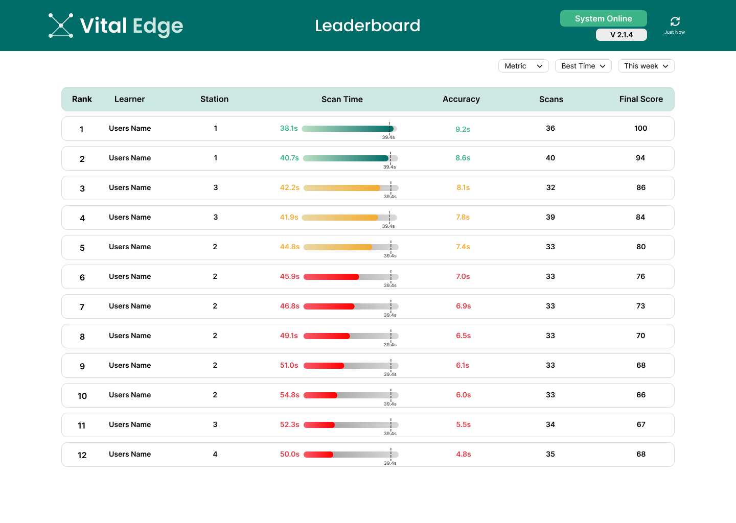
Leaderboard
We included a way for students to view their scan times, accuracy, how many scans it took to complete the training, and their final score in relation to other members in their cohort.
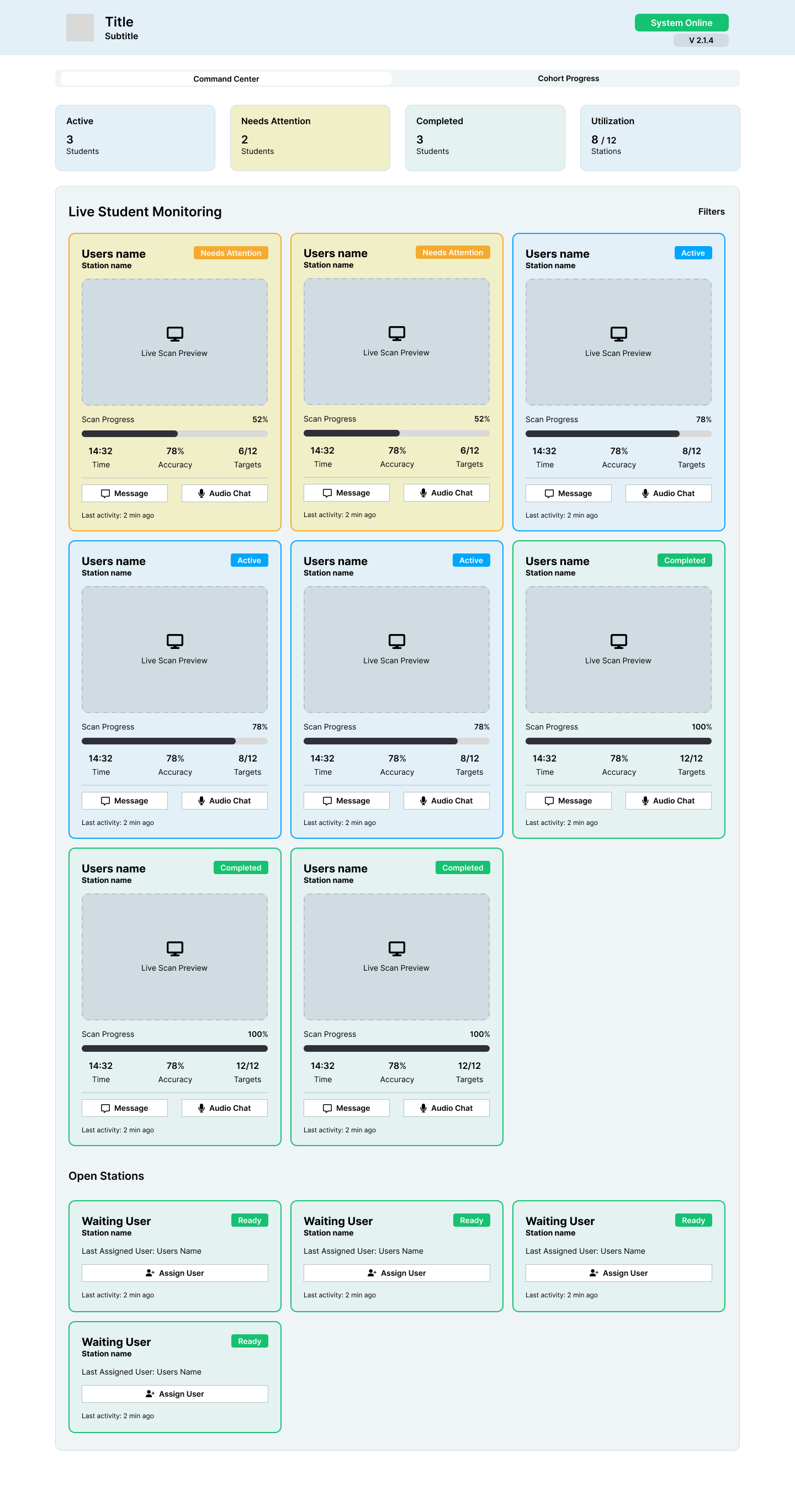
Instructor's Dashboard (Command Center)
We included a way for the instructors to view the progress of all their students in one centralized hub. This view includes students who needs instructor feedback or to log errors in the scan (the "needs attention" label), students who are currently performing scans (the "active" label), and students who have completed their scans and who have received the instructor's feedback (the "completed" label).
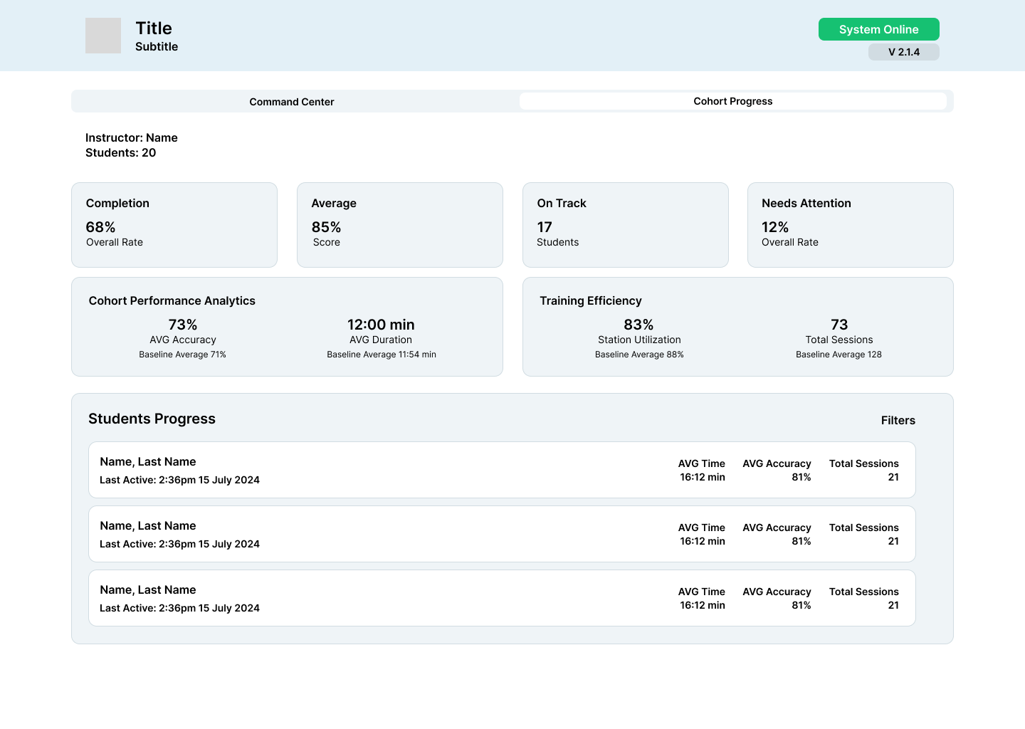
Instructor's Dashboard (Cohort Progress)
The cohort progress page provides a brief overview of how well the instructor's students are doing.
Instructor's Pop Out View
The instructor pop out view allows the instructor to view each student's score, accuracy, live video when performing the scan, and provide feedback in real-time.
Data Visualization Explanation
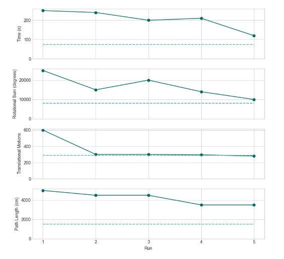
Line Graphs
The line graph visualization is designed to help trainees track their performance over multiple runs. Each graph focuses on a single performance metric, as the four metrics use different units and cannot be meaningfully combined into one plot. A dotted line indicates the target or expert benchmark, allowing trainees to see not only how their current performance compares to previous runs, but also how close they are to the goal.
One limitation of this approach is its sensitivity to extreme values. For example, if a trainee’s translational motion count drops from 10,000 in one run to 2,000 in the next, the scale will adjust so dramatically that future variations may appear flat and harder to interpret. This means that while the line graph is effective for showing trends over time, it may require additional adjustments, such as axis scaling, to remain useful in the presence of large outliers.
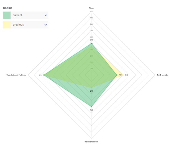
Radar Chart
A radar chart is a multivariate visualization where each metric is plotted on its own axis radiating from a central point. In this example, a trainee can view their performance across four metrics in a single, unified shape. Changes in the shape from a previous to a current run can reveal areas of strength and highlight metrics where performance lags behind.
The radar chart is criticized by datavis experts, for the ways it can lead to the misinterpretation of data. One example is how readers tend to over-evaluate differences in variables based on the shape of the chart. However, this use case is simple enough that most of these problems aren’t present. More on the downsides of radar charts can be read here. It was chosen to feature in our prototype because of its aesthetics.


Project Handoff
Opportunities for Improvement
-
Integrating the models from the MSU Computer Science team will:
-
Remove the manual data entry in Excel and move closer to automation.
-
Allow the Henry Ford team to create an image scoring metric to provide learners with additional feedback.
-
-
The Henry Ford team demoed a current iteration of their automated process for collecting feedback which informed our future-state user flows. More research and testing with this will be needed.
-
Implementing AI to assist in providing automatic feedback to students could reduce the strain on professors.